Setting the scene
MANUAL is a health-tech brand whose goal is to help men take better care of themselves, be it by tackling Hair Loss (HL), Erectile Dysfunction (ED), Weight Loss (WL), Sleep Loss (SL), Testosterone Replacement Therapy (TRT) etc.
We do this simply through our e-commerce site, where customers visit, select a health category they need help with, take a quiz, and then we recommend a treatment for them, which they can purchase either as a one-off or subscription. To date, HL is our top-performing category, with WL and TRT following closely.
This project came about rather unconventionally; we never set out to revamp this feature. Instead, the initiative was born from the combination of a research study with our cancelled customers and the introduction of a brand new, one-of-a-kind treatment exclusive to MANUAL, the 'All-in-one capsule'.
My role
I led the design efforts end-to-end, working alongside a stellar crew of 2 FE and 1 BE developers, my PM, our Head of Retention (HoR), our HL Category Manager, our Lead Clinician for HL, a Lead Customer Service agent, and a UX copywriter.
Scope
Constraints-wise, there was little for this project besides designing it for Web App; we built it in next.js for a seamless development transition to eventual Mobile App development farther down the line.
Sooooo... why'd you cancel?
Before the switch plans project had even begun, our HoR enlisted me to arrange interviews with cancelled customers for an entirely separate project, the goal being to use the insights to redesign our cancellations journey.
Around 700 (MoM) HL customers were cancelling by M3. Digging into our cancellations questionnaire, we found the top two reasons were 'It's too expensive' (23%) and 'I don't want a subscription' (18%); we knew we'd struggle to win these customers back, so we focused on the third and fourth-ranked reasons; 'I'm overstocked' (15%) and 'I haven't seen results' (12%).
Using screener surveys, I arranged interviews with six cancelled customers, building discussion flow guides in Miro to cover topics like when they first noticed their hair loss, what they did, what brought them to MANUAL, etc. But really, what I wanted to dig into was:
- What led them to become overstocked?
- How were they using the treatment, specifically?
- Why they hadn't seen results?
- What were they expecting to see?

Cool... so what'd you find out?
The study uncovered two key findings:
Key insights
- Customers felt they didn't see results or were becoming overstocked because our active ingredient, Minoxidil spray, left an undesired greasy residue when sprayed on their Hair Loss areas.
- Customers found the residue embarrassing and, as a result, would either stop using the treatment altogether or begin to use it sparingly.
- Those who used it sparingly wouldn't finish their bottle in time before their next one arrived, leading to them being overstocked.
I reported these findings to our HL category manager; however, given no treatment on the market could solve our grease issue, there was little we could do to solve this customer problem... Or so we thought!
.png)
Enter the 'All-in-one Capsule'
A month later, our HL category manager called my PM and I into a meeting to discuss a new treatment formulation exclusive to MANUAL, the 'All-in-one Capsule' (AIOC).
This treatment was revolutionary as it combined Minoxidil and Finasteride into a single capsule, taken orally, whereas before, the two components were separate, i.e. Minoxidil Spray and Finasteride tablets; and most importantly, taking the treatment via capsule, meant no greasy scalps!
Additionally, our head of customer insights reported the following data from our AIOC tester group:
- 100% of respondents felt their expectations for the first 6 months “met” or “exceeded”
- 100% of respondents found the product “very easy” to use (rating 5 out of 5)
- ~90% of respondents report being satisfied with the product, reporting better results vs other plans (29% thicker hair, 63% longer growing hair, and 8% improved hair density)
We immediately knew this treatment was a winner and agreed on identifying opportunities across the web app to promote AIO capsule uptake as our action plan.
.png)
The part where 'switch plans' comes in
We identified 'switch plans', a feature where customers can select to switch their treatment and view what else is available, as our primary touch-point to promote the AIOC.
Why? Well, we knew our most popular treatment, Minoxidil spray, was the cause of customer friction; of the entire Web App, if customers weren't happy with their treatment, they would either:
a) Cancel (we'd really prefer they didn't)
b) Book a call with our clinician (We didn't want to burden them with more calls)
OR
c) Ding, ding, ding; look to switch their plan!
Given the guts had already been built, we felt revamping the feature would be a great way to test our concept quickly with minimal dev work.
I started by auditing UX and UI issues with the current journey.
UI issues
- Icons are so tiny they're a little useless.
- Carousel UI prevents customers from comparing treatments, as they can only see one at a time.
UX issues
- We show the customer's current treatment as an option to switch to.
- We show all the plans customers could switch to, failing to educate them as to what makes one treatment better than the other, i.e. if a customer doesn't like greasy hair, they probably shouldn't switch to another Minoxidil spray-based treatment.
- We generally don't help the customer make a decision.
I Followed the audit by mapping out the principle UX for the feature update. Customer selects to switch plan > we present them with a list of reasons to select from indicating why they'd like to switch > they're taken to a page explaining the switch reason, along with what we propose for them to switch to

Asking the experts
Next up, I needed the help of our lead hair loss clinician, Mike, to map out the feature architecture, using his expertise from giving treatment advice to customers hair loss treatments i.e. how their treatment's going, why they're not seeing results, etc.
Together, we reviewed all seven hair loss treatments, mapping the reasons a customer would want to switch from said treatment. Mike, then helped map within the switch reasons, which treatments he would suggest customers switch to and in which order of priority; finally, I then worked with one of our lead CS agents to review and card sort the order in which we prioritise the switch reasons for each plan.

Testing 1, 2, testing
Several UI options were explored, eventually settling on a design we felt was most optimal requiring the least dev work.
I built the prototype in Figma and arranged usability testing against six participants, documenting the sessions in Miro.
Our tested assumptions:
- Participants can discover the switch plans feature
- Participants can successfully select a switch reason
- Participants can successfully switch plan
.png)
Our findings
Generally, the designs tested well across the board, uncovering three key insights that needed improving ahead of the release; the findings were:
- 2/3 of participants wanted their current plan price to be surfaced on the suggestions screen.
- 2/3 of participants would have preferred to see just one recommended plan instead of >1
- 3/3 participants indicated a desire to see the difference between their current and suggested plan from an ingredient perspective
.png)
Fixes
Following the test, I created a new iteration with the following changes.
The customer's current plan was added to the top of the switch reasons page so that they could compare their current plan against our suggestions.
The treatment description textbox was replaced with the treatment's active ingredients.
If there was more than one suggested treatment, rather than show them all stacked in a list view, I added an 'other treatments' dropdown to help customers focus on our top suggested treatment and if they wanted to see what other suggestions we had, they could expand the dropdown to see more.

Teamwork makes the dream work
Once the designs were complete, I briefed our UX copywriter to go through each switch reason and write short descriptions explaining why customers might be experiencing those issues.
The copy was used in a detailed handover for the devs to map out the switch architecture so they knew which matched with which switch reason.

Into the wild
We launched an A/B test using A/B tasty, limiting traffic to ~30% to reduce risk and monitoring it over 10 days. Testing results saw ~50% of customers selecting to switch plan, chose the all-in-one capsule; this gave enough conviction for the feature to go live 100%.
We then took it a step further by working with our CRM and retention team to implement the feature across two additional touch payments; reactivation and our payday campaign as this would help spread awareness of the feature to customers.
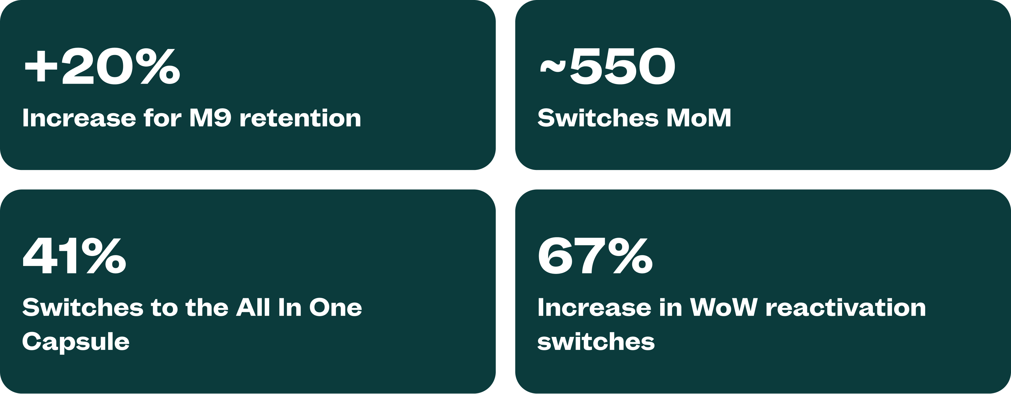
Over the last 12 months we saw some great statistics from the launch of this feature:
- A +20% retention boost for M9, along with +15% for M6 and +9% for M3
- To date, ~6000 customers switched their plan, breaking down to ~550 switches MoM
- ~80% of those switches collectively were to oral-based medications, and ~41% specifically to the All-in-one capsule
- Integration of the feature to reactivation and payday grew AIOC switches from 3% to 70% of our customer base switching WoW
All these achievements ensured successful customer treatment whilst bolstering MANUAL commercially through boosting retention.